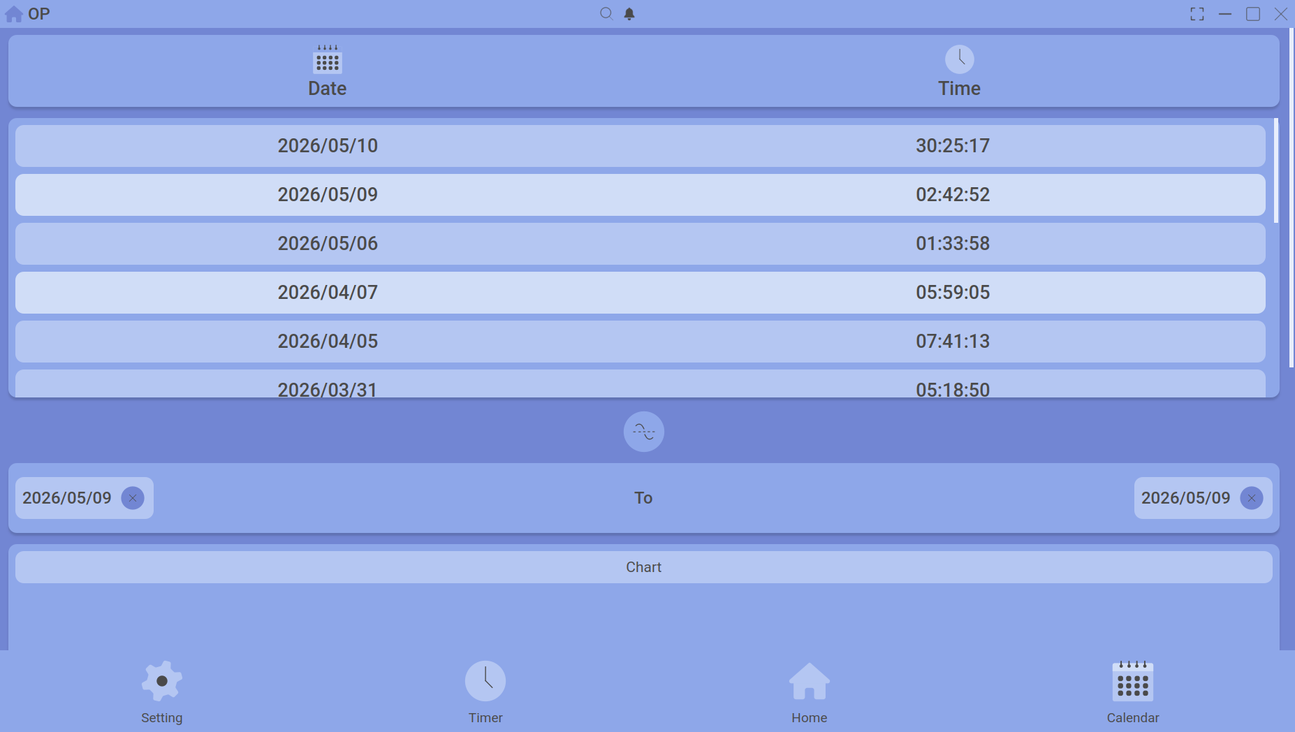
Compare the average time you spend on two different activities over a date range. This is useful for spotting trends – for example, are you spending more time on “Study” or “Design” this week?
The chart highlights two selected activities for comparison.
How to compare
- On the Home dashboard, find the chart section (usually a bar chart showing daily totals).
- Click on the first activity you want to compare (its bars will highlight).
- Hold Ctrl (or Cmd on Mac) and click on a second activity.
- The chart now isolates those two activities, and the legend updates to show their average times over the displayed date range.
What the numbers mean
The averages are calculated from all sessions of each activity within the selected date range. Breaks are not included – only pure upload time counts.
Adjusting the date range
Use the date picker or the arrow buttons next to the chart to move through weeks. The averages update automatically.
Resetting the view
Click anywhere on the chart background (not on a bar) to deselect all activities and return to the full overview.
Once you’ve spotted a trend, double‑click any activity to see its full detail.